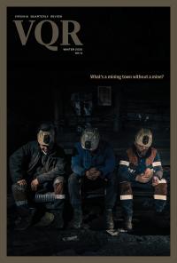
Image
In 2021, after forty adult years of study, practice, and teaching, and nine published volumes, I gave up poetry. In 2022, with no formal training, no understanding of my visual-art skills, and a deep yearning to be vulnerable again in my studio practice, I became a cartoonist. Now I make work that more people see and understand and easily dismiss. Now, as I make single-panel cartoons more in keeping with underground traditions than with The New Yorker’s oeuvre, I’m still dwelling in obscurity. But I’m posting madly and contributing weekly to an online journal and feeling more and more liberated. It’s like I’m a cub reporter: I’m a cub cartoonist. Or maybe that’s called a tadpole or a foal, something just a wee bit wackier.
The single-panel cartoon is not a graphic novel—which publishers and readers alike ask me about when they hear I’m cartooning, i.e., when will I write a graphic novel and climb Art Everest? Instead, the single-panel cartoon is an older and more journalistic cousin of the graphic novel and the comic strip—image and text self-contained within the single panel, nothing else to see. As a function of scale, there’s significant pressure on the formal elements in a single-panel cartoon (I’ll switch to calling these just “cartoons” shortly) which demands of the two languages employed—images and text—both precision and economy. I may not be writing poems anymore, but those demands certainly feel familiar.
Who is a “cartoonist”? With so many people making DIY cartoons, aided by our access to editing tools in various apps, the art form has become ubiquitous. Think of the meme, the GIF, the post: Cartoons are the art form most made by people who don’t make art. So here we are, making and processing cartoons, with our feelings all over the internet, and interacting with each other.
The cartoon itself has changed too. Given how spectatorship in our digital age continues to redesign the way we process information—due to the dynamism and fungibility of the internet—the cartoon’s “frame” is no longer a rectangle on a page. That’s not all: Each of a cartoon’s elements is different in the context of digital consumption, and new in ways worth exploring. Which leads us to think in this essay about a vital aspect of the cartoon, and that is color.
Color is the most affective aspect of the single-panel cartoon, and thus where we find our feelings. Color also has cultural power, symbolism, and a profound relationship to dreams. Thinking about color in a cartoon provides a fertile site for exploring who we are and, in turn, for learning about cartoons in the digital age.
What are the feelings and thoughts evoked by a cartoon? What are the feelings and thoughts invested in making them? A close study of color might offer some clues. At the very least, it allows us to pause and spend some time with art.
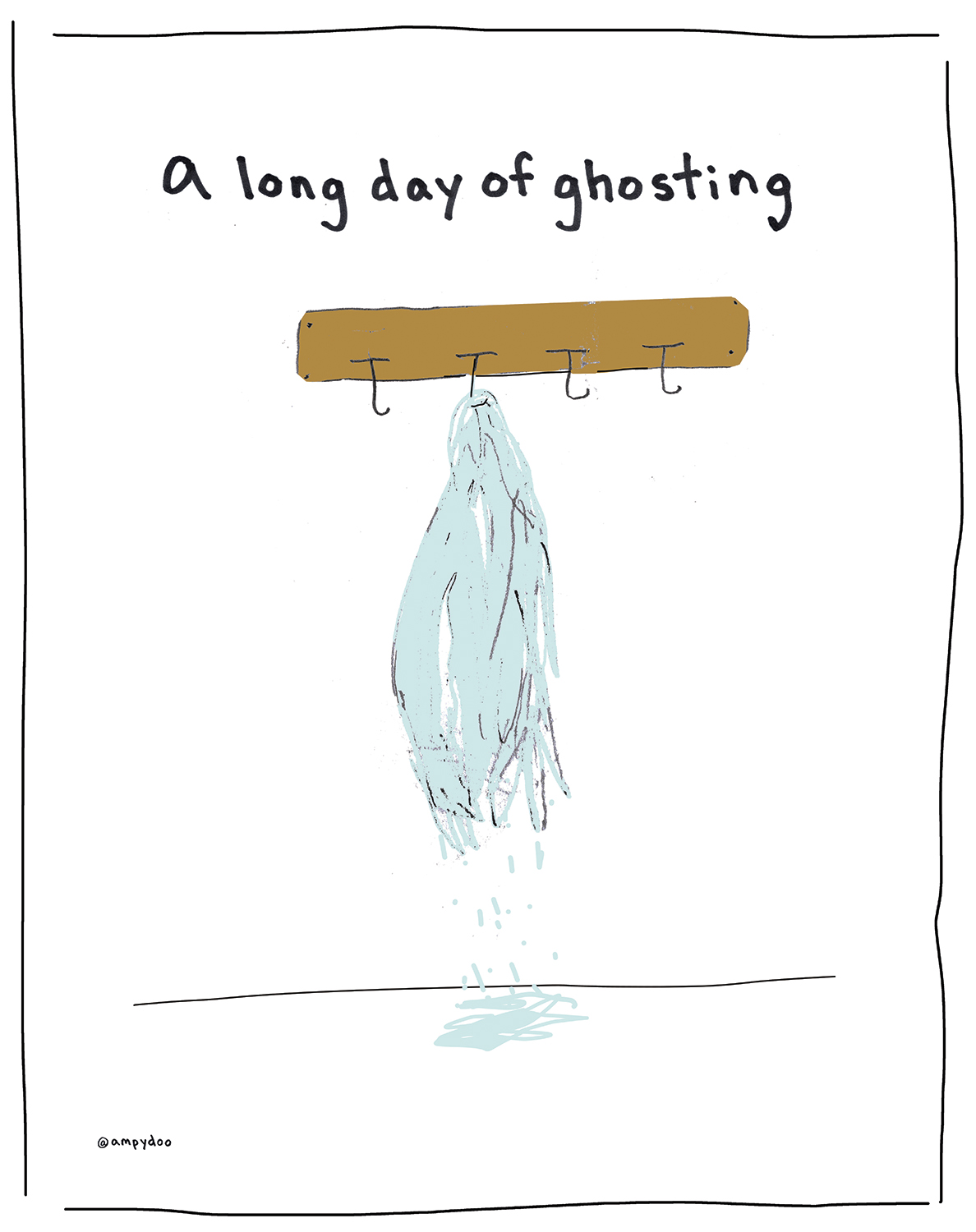
We begin with a cartoon.
What do we see? An image of a coatrack on which a diaphanous garment has been hung, with its color dripping to the floor below. The image is drawn in a manner reflective of handmade art; the rendering is cartoonish, less realistic than symbolic, though neither crude nor naïve. The drawing is simple and accessible.
The caption rests above the image, a sentence fragment that works somewhat as a label, but given its position (i.e., not below) is less fixed than a label or a title, even. We move from the image to the text easily, as our understanding of the complexities of the joke(s) compounds; this movement is called a bounce. We bounce between the image and the text, making meanings.
What do we know?
Let’s make a list:
What do we want to know as a result of the bounce?
What I like about all of these questions is that they make meanings too, without offering answers. I don’t feel stumped, or thwarted, or even in need of additional panels; I’m content to laugh, hmph, laugh, think, muse, etc. And that’s all in the bounce.
What I like most: The colors of the ghost’s garment, and how the garment puddles in the same colors. It’s a kind of melting, but it’s also a costume to be worn. And that idea—the existential properties of ghostness—is communicated by the colors of the puddle. The color complements the ideas, or maybe even more precisely, creates the content.
Color in a cartoon often succeeds by association, or by contradiction and contrast; colors connect to emotions, a fact on which most neuroscientists and psychologists agree, even as no universal explanation for how exactly holds true, since no color stands for just one thing. For example, the color green could just as easily riff on Go, Dog. Go! as it could imply “I want what you’ve got” in a cartoon when a face flushes green with envy. And there are so many greens: Shrek, INS green cards, The Green Mile, Green Berets, Green Day, etc. The same variance in meanings occurs across the color spectrum: There’s no standardized system that lets any one color signify the same thing each time, even when we’re limiting the context to a single, specific, and possibly more homogenous culture. Even then, colors mean differently.
In 2020, psychologists Christine Mohr and Domicele Jonauskaite surveyed more than 4,500 people in thirty countries to gain some insight into the connections between colors and emotions.
First, all participants found it quite easy to associate colors and emotions. This was particularly true for colors such as red, black, or yellow. Other colors, like brown and purple, had few referents. Participants did not select one emotion for a color, but often chose several emotions. In turn, different colors were linked to the same emotion, such as pleasure, which was connected to red but also yellow, orange, pink, purple, and turquoise.
Red was the most controversial color in terms of valence. For some, it was a very positive color—the color of passion, love, and desire. For others, it was a negative color—the color of danger, anger, and hate. For others still, it was both positive and negative. What connects all these emotions and ideas is the fact that red is empowering, activating, and strong.
Some aspects of color seem easily parsed when attached to a form: Color may well symbolically reinforce an object’s function (red=stop), or correspond to a culturally agreed-upon idea (a black raven on a coffin=the Grim Reaper, in the West). However, even if we are seeing a red stop sign telling us to brake or a black bird standing for Death, more generally color in cartoons tends to be less referential than in realistic art. Why is that? Because the off-kilter context of the cartoon allows the cartoonist to use color differently; color in a cartoon is rarely deployed on behalf of realism. Arguably, color and scale are the elements in a cartoon that least often pretend to be “real.” A purple stop sign wouldn’t shock us in a cartoon that uses orthodox colors, nor would the combo necessarily challenge our understanding of reality; but the purple stop sign may well mean something we haven’t thought of before. Those kinds of new meanings are the essence of cartoons.
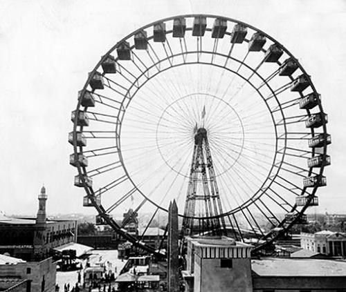
Here’s a photo taken for the Chicago Tribune of George Washington Gale Ferris Jr.’s wheel—the first Ferris wheel—originally designed for the 1893 World’s Columbian Exposition in Chicago:
Here’s what my son sent me for Father’s Day last year:
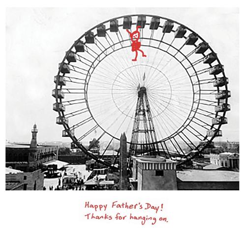
I loved my Father’s Day card, which arrived as a JPEG in a text. I shared it with friends as an attachment via email and via Instagram messaging. Then I posted the card on Facebook (with my son’s permission) and got 131 likes and 5 shares.
In this case, the image depends upon color as part of its content: The use of red connects the hanging figure (ostensibly me, and yes, I might be a little heavy at the moment) to the caption (sentences describing my behavior along with a wry understanding and appreciation for my fortitude). It’s a homemade card, the personal touch a big deal for me, a fact my son knows. It’s an allusion to the cat meme, Hang In There, Baby!; it’s a digital collage; and it’s an example of how memes have changed the worldviews of two generations of internet users. By screen-grabbing or downloading an image from the internet, then doctoring it into a meme that riffs on a meme, the DIY cartoonist has contributed to the ongoing transformation of the genre we call single-panel cartoons. In the tradition of the homemade card, the Hang In There, Baby! has been adapted, or “interpolated,” as musicians who borrow OG melodies might say, with my son making the same kinds of decisions that someone such as Gary Larson might make, or Dua Lipa when she lifts a melody from INXS’s “Need You Tonight.” And then dissemination kicked in—or, more precisely, it was always about dissemination, the digital age contributing to the consumption of the Father’s Day card, a card for me, consumed further by likes and shares, and generating social capital.
The bright contrast of the red, and the ease with which red symbolizes danger, work together as a kind of joke. Plus, the black-and-white world makes the figure’s actions stand out, implying even more fortitude: It has taken a special (red) man to stand by his son in a black-and-white world, where doing so feels like hanging from a Ferris wheel. Moreover, the fact the son who made this cartoon is acknowledging that parenting him has been like a carnival ride, and visually represents his own ups and downs, makes the joke bouncier. His self-awareness here comments on parenting, son-ing, and growing up—all of which happens as a result of spot color and contrast. For those of you making cartoons by drawing or adding text to a downloaded image, or sourcing from your photos, or playing in Canva or Mematic, spot color is of course a viable option: Our apps allow for color to be used and shared easily. Color can be applied to emphasize or make a point. For those of you cartooning, and coloring fully to effect, filling a shape in a new layer with the Paint Bucket in Photoshop, there are even more options for meaning. For my son, the app lets him draw a hanging on stand-in for his dad; the Junior Cartoonist adds a figure and uses red as we’ve identified above, the color functioning in a multitude of ways, signifying and associating.
Here’s a list of some of the ways color may work in a cartoon, a list by no means comprehensive:
One tip about the use of color for both cartoonists and cartoon lovers: To be effective in a single-panel cartoon, color needs to be used in a couple of the ways listed above simultaneously. For example, one might say that my son’s card uses color according to items 2, 3, and 7 on the above list.
Here’s another example of a cartoon that includes color as part of its meaning-making in a very different way from what we’ve seen already.
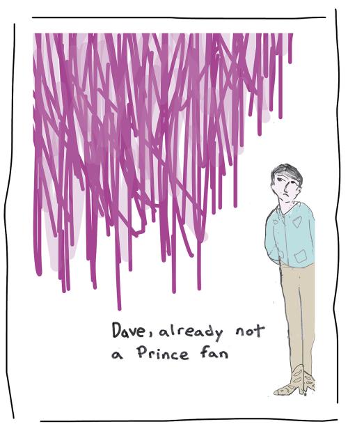
What do we see? Most prominently, a lot of purple that seems to be falling from above, both straight down and at a slant, along with an extremely skeptical if not annoyed person named Dave, who’s not yet doused in purple but soon will be. The purple lines aren’t realistic. Dave is drawn more closely to being realistic, his body language identifiable, but he’s still a cartoon character.
Dave’s dressed in khakis, with a light green work shirt (maybe…it has extra pockets of some kind), and his boots match his pants. There are spurs on the heel of one of the boots, presumably on both. His head is tilted in a position that seems to be a slight recoil; his facial expression is relatively flat. His arms are behind his back, and he’s not doing anything except looking at the purple lines. Even if the weather isn’t to his liking, there’s nothing he can do about it, although with one foot out of the frame, he might be planning to flee. He’s white, tall and thin. He looks like he’s in his thirties.
The caption is handwritten, a little wonky but not enough for us to infer that the handwriting belongs to a person a bit askew (which is a thing in cartoons). While the caption could be voiced, the knowledge it presents doesn’t read as external to Dave, more like a description of his emotions that we can gather from his body language and expression. In this sense, either the caption or Dave could be understood to illustrate the other.
The cartoon depends on a cultural touchstone, our knowing Prince’s song “Purple Rain.” Does that make the work obscure, or possibly of its time only, and thus obsolete? Perhaps. But “Purple Rain” is widely known, and as of this writing, it has been played 562,640,206 times on Spotify (or 562,640,207, as I’m playing it now while I’m writing). That’s more than half a billion. As I’ve argued elsewhere, a cartoon has more of a distinct relationship to time—and to the various simultaneous times and timelines it invokes—than, say, a painting in a museum.
The cartoon takes Prince’s lyrics literally and makes purple rain “real,” at least within the world of the frame—that’s the first joke, in a sense. Dave’s response seems legit: I too wouldn’t want to be rained on purply, and especially by rain with such broad strokes. Yuck. That he never liked the song makes Dave’s irritation funnier, at least to me, since he’s about to be caught in a literal purple rain.
There’s an efficiency to the cartoon: It doesn’t bounce and bounce. We have access to its meanings, and we don’t need a lot of further conjecture to complete the dynamic (what Scott McCloud terms “closure” in his brilliant Understanding Comics, when talking about how the reader moves from one panel to another in a visual sequence). But what if we make this a little more interesting and use color to get us there?
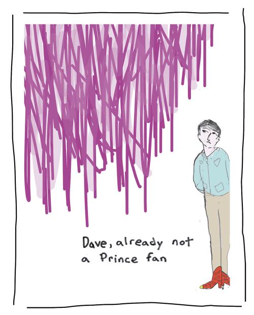
We’ve made Dave’s boots red, with gold tips; that’s the only change. We notice the boots now, rather than have them fade into the color of his pants. The change seems simple, and the results are anything but, because now we may well profile Dave’s whiteness.
I’m a white person, and I love Prince, and I love the song “Purple Rain.” I would not suggest that all white people aren’t inclined to do so, or that I’m an anomaly (think 562,640,207). Nonetheless, by reddening his boots, we have drawn attention to them, to this white man wearing Western-style boots complete with spurs. That assessment seems to travel up, I think: Now I see Dave’s pants and shirt, and I think Western wear. And now I have my own biases activated, as I profile him: I think he’s funnier as a white man who might be into country music rather than the genius of Prince, who has never been a Prince fan, and sorry, here comes the purple rain.
Am I wrong to think more about his whiteness as a result of noticing his red cowboy boots and spurs? Is it so simply a matter of calling out his garb as Western, to activate my biases? I’ll leave those questions to you, just as you probably know what I think. I am the person who drew Dave, after all, and I made his boots red for a reason.
Let’s consider two more approaches to color. The first might seem counterintuitive, but the counterintuitive is a cartoonist’s friend.
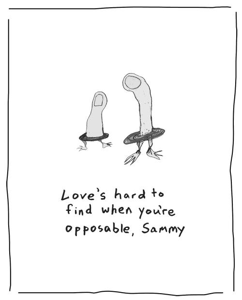
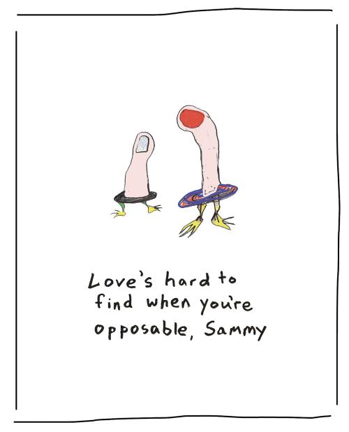
What do we see? Two disembodied fingers (unhand me!) seem to be alive, bipedal nonhumans standing in an undefined environment upon webbed, duck-ish (or goose-ish) feet. One of the figures could be a thumb, the other a long, crooked forefinger. Either they’re wearing some kind of tutu disks around what could be conceivably their waists, or they have disk-shaped waists as part of their anatomy. The longer finger bends toward the thumb, and its posture suggests both age and authority. The smaller figure seems to be looking into a nonexistent background, which to me implies looking into the future.
Our assumptions about the relationship between the two finger aliens and their relative ages (they would have to be alien, since they have those funky feet, those disks, and are apparently alive) seem safely validated by the caption. One of the characters addresses Sammy, the Other; I think it’s a safe assumption that the taller character bends to address the shorter, thus making Sammy, thumb-alien-kid, the addressee. That “Sammy” isn’t “Sam” or “Samuel” also supports this reading, the forefinger alien’s use of the diminutive being consistent with an age gap.
Alternatively, we could be Sammy, and the caption might be addressed to us. I can see the logic to such a reading. Testing that interpretation, I fail to find any aspect of the cartoon that might contradict this take, which brings up a new idea, that even a cartoon with simple images and captions offers the possibility of multiple, conflicting interpretations. Moreover, those multiple interpretations could each be valid, just as they contradict each other when taken together.
As a cartoonist, a reader of cartoons, and a teacher of texts (cartoons, film, novels, etc.), I welcome such a paradoxical result: Interpreting a work of art doesn’t require that we get the one right answer, rather that we understand the possible meanings of the artwork as simultaneous and nuanced. I’ll go further: Embracing ambiguity in this way provides me with one of the great joys of my life as an artist and a teacher; the existence of multiple “right” answers connects to how I understand humanity and human difference and the power of our differences. When you and I disagree about Sammy, and we’re both “right,” we get to be ourselves. That lines up with my politics and my faithview.
Back to Sammy. The first level of the joke resides in the notion of the opposable thumb, and how a thumb isn’t like the other fingers. Being “opposable” sets Sammy apart metaphorically as well; that’s the second part of the joke, the bounce activated, as we see this character looking for love and being schooled in loneliness. That both characters are really, really different validates the authority figure’s experience. This waterfowl-footed disk-waisted finger alien knows what it’s like to feel alienated.
Given how Sammy is being schooled, maybe the thumb is a young finger. I’m with Sammy here, empathizing. I have older siblings. And in this emotional dynamic, Sammy becomes our proxy. It makes both readings “true,” even though they are mutually exclusive. How cool is that.
Interestingly enough, although I’m a parent, I identify more with thumb-alien Sammy than I do with the oracular older finger offering advice. Maybe that’s because I like to think of myself as “opposable.” Maybe the metaphor connects to more than just my notion of love and companionship, but also to my independent streak. Maybe—especially for students of history and American political theory—this independent streak has a basis in the principles of democracy that we have internalized (see: Ralph Waldo Emerson’s famous 1841 essay “Self-Reliance.”) Sure, that’s a lot to put on Sammy, but maybe.
Now let’s do Sammy’s nails…
What’s different? Not a whole lot, but some of the meanings have changed, and some of our ideas about the meanings have gained new evidence.
Interestingly, I would say that the addition of color thus far has provided us with new meaning only when it comes to items 1 and 5 from the list above, and otherwise validated our prevailing interpretations.
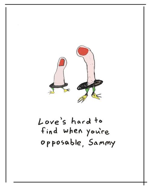
Let’s complicate matters by playing more with color…
Now we’ve done it, or done something. Sammy’s gone glitter, and the cartoon has changed; now we have an impression of “opposable” that includes gender performance, and possibly even queer coding. Sammy seems now to be a thumb whose very nature is to be opposable, living in a world of fingers—that’s who Sammy is—and who has furthered that position (positionality is the hip word) by going glitter. And Sammy is a gender-neutral name.
And one more color shift…
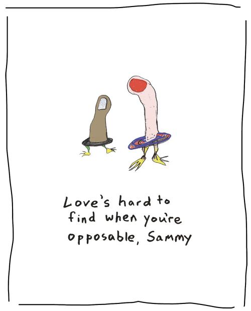
By changing Sammy’s skin tone to Black or Brown, we’re making the cartoon timelier, but when these simple shifts are combined, something else happens. What was before a kind of cute cartoon about opposable thumbs and being different, with a dose of good ol’ American independence, has now reversed polarities; now the cartoon’s a satire about the forefinger and heteronormativity.
Sammy being opposable is who Sammy is; Sammy being Black and opposable is who Sammy is. Sammy wearing glitter nail polish is Sammy being fancy, whether we read it as queer coding or not. The forefinger—who seems to me very clearly an authority figure if not a parent, and certainly behaving like one—sees who Sammy is and worries for their future happiness.
Doesn’t this scenario sound like a “coming out” moment? When the anxious parental figure expresses concern for the youngster’s safety and happiness? The scene has become one that explores the forefinger’s passive-aggressive response (some parents would argue legit) to Sammy’s being who Sammy is. But let’s say Sammy is indeed queer, or even Black and queer, or to play on the forefinger’s stereotyped assumptions even more, trans? Finding love doesn’t seem to be the issue for who Sammy is, or who we are, I would argue, at least not in terms of anyone’s identity. Life for Sammy as a queer person might be harder in a homophobic world, but that’s not the same as finding love.
Another shift has occurred in our reading of the final two versions: The word opposable has gained a bit of power, as the forefinger recognizes that Sammy’s a thumb and is biologically opposable, but also seems to emphasize the resistance to norms the word implies. Sure, that nuance was present when Sammy’s nail was red, but with the anxiety of the heteronormative authority figure rising, that slight dig seems a bit more present. Now Sammy seems a little blamed for being Sammy.
Here, the use of glitter nail polish and then a shift in skin tone have changed the subject, so now the cartoon is less about Sammy and more about the speaker. That’s the kind of work that the slightest revision can do in a single-panel cartoon, and why we’re paying so much attention to each aspect of the artwork, and coloring boots and such to see what happens. As I say to my students, there are more decisions here than I can make, but by studying those decisions, I can put into play what I intend.
We’ve done a lot of close reading so far, tuning the gaze to the study of the cartoon. Nonetheless, there’s more to be understood by thinking outside the box (in this case, outside the frame). How is a color perceived? What about the relationship between color and the psyche? Is color the same in the eye and the mind? While these questions loom larger than this essay can cover, one consideration warrants our attention, and that is the relationship between dreams and color. Do we dream in color? Given how colors engage emotions the question seems germane. Let’s look at the science to see.
To begin, we turn to 1942, and the results of a questionnaire posed by W.C. Middleton to a group of college sophomores, in which he found that nearly 71 percent of respondents reported dreaming in black-and-white most or all of the time. In subsequent studies over the years, these numbers have reversed in college students, as shown by psychologists Eric Schwitzgebel, Changbing Huang, and Yifeng Zhou in a 2006 study titled “Do We Dream in Colour? Cultural Variations and Skepticism,” in which they attribute the reversal to the advent of color television, film, and the internet. Are we to trust the idea that media consumption determines the palette of our psyches? That I can’t say, but the general reversal over the past seventy-five years interests me.
More recently, in a 2018 article in Sleep Medicine Reviews, Peter Fazekas, Georgina Nemeth, and Morten Overgaard discuss the phenomenon of the “white dream”—a phrase that I don’t know how to handle, in terms of race—which is “the feeling of having had a dream experience without being able to specify this experience any further,” an event that makes up “almost one third of all dream reports.” The three authors used EEGs from various studies, along with neural correlates relevant to recalled and unrecalled content, and evaluated what hot zones in the brain lit up in the lateral frontal cortex and temporal lobes when dreams were “white.” As they state in the almost-witty title of their paper, “White dreams are made of colours.”
Here’s one last data point to consider, and this one’s a doozy. In their 2011 paper, “Life Span Differences in Color Dreaming,” Hitoshi Okada, Kazuo Matsuoka, and Takao Hatakeyama reported that both a 1993 and a 2009 survey found that “approximately 80 percent of subjects younger than thirty years of age experienced color in their dreams”—data that lines up with what we’ve learned thus far. But fascinatingly, by the age of sixty, only 20 percent of respondents reported experiencing color while dreaming. The authors speculate, as others have, that people in between ages fifty and sixty in 2009 reverted to black-and-white media influences when dreaming; once again, a take that seems to me less fact than fancy—but wholly relevant as we think about the digital cartoon and color.
I’m not a scientist, even if I do occasionally refer to the single-panel cartoon as a culture lab. But I understand that when color stands for something in a cartoon—race, stop, envy—it does so as an externalized marker. In other words, the broader, more general associations we have with colors come to us from external sources. When we associate other kinds of meanings with colors, ones that have no clear referent in cultural regimens, those seem “ours”; those are the kinds of colors that I think bounce more as part of the imagery in a cartoon. So if you’re a purple guy, go purple; if you have feelings about the wrongness of a red wheelbarrow, try to make a different color have meaning to your viewer. Plumb your psyche when you view a cartoon to see what feelings are made by the colors. And whether you’re someone who cartoons formally or doodles dads for Father’s Day, consider how colors work in your viewers’ psyche—and think about how to move colors from perception to power, as an idea of the dreams we all have. As in a dream, in color or black-and-white, the meanings of a cartoon await.